
HRV Frequency Domain
If you've never connected Pulse Sensor to Processing, follow this tutorial first ;)
This page is a continuation of our exploration of Heart Rate Variability. In this issue: Taking the Time.
Most people, when they think of frequency analysis, think of Fast Fourier Transform (FFT) or Power Spectrum Analysis. These methods use recursive algorithms to untangle the composite frequencies contained in a complex waveform made up of many frequencies. The audio spectrum ranges from 20Hz to 20KHz. That's much faster than we need for HRV analysis. We can expect the frequencies found in HRV studies to range from 0.04Hz to more than 0.4Hz. That is quite a low frequency range.
What follows is a description of code that derives the HRV signal frequency in a non-traditional way. We make no claims as to it's efficacy, and it is posted here for entertainment purposes only. Download this and all of our HRV Processing sketches here: PulseSensorAmped_HRV_Repository.
What we've done is modify our Time Domain code to visualize frequency. The idea here is that the blue line waveform of the Time Domain wiggles up and down as it slowly makes its way across the screen with each one of your heartbeats. Frequency, then, is contained in this Time Domain wiggle. Each time the blue line changes direction, that constitutes 1/2 of a wave. We're using that 1/2 wave to calculate instantaneous frequency. Here's how it looks:
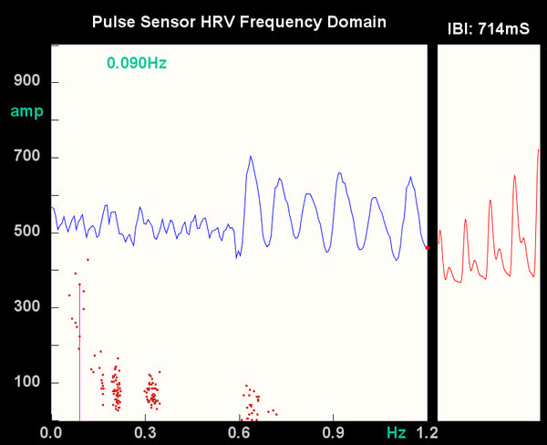
Each red dot represents the frequency derived from 1/2 wave in the blue data line. The horizontal position of the red dot represents the frequency (as shown on the X-axis legend) and the vertical position of the red dot represents the power, or amplitude of the signal at that frequency. In the example above, notice that the left half of the blue waveform is small in amplitude and high in frequency compared to the right half. I was just poking around on the Internets during the left half portion of the sample, and then I began focusing on slow steady breathing, which made for the large sinusoidal waveform.
The red dots clustered around 0.3 and 0.6 were plotted during the first half of the blue waveform period, with low(er) amplitude, and high(er) frequency. The red dots far to the left of the screen and ranging from 200 to about 430 on the Y axis were plotted during the right half of the blue waveform, when I was focusing on deep breathing. Other things to note about the code window: the most recent HRV frequency is printed in electric green on the top of the data window, and the most recent data point is indicated by the vertical pink line. Also, In this sketch, you can press the 'W' key to turn on and off the blue wave if you want a clear shot of the frequency power spectrum, like so:

We know this is not a true 'power spectrum analysis' of the IBI waveform, but it's a working approximation for fun. As we get better at maths, we will add more in-depth HRV analysis code. The code has some nice keyboard command features built in.
- If you press 'S' or 's', you will save a .jpg image of the program window for posterity in the sketch folder
- If you press 'R' or 'r', you will clear the data window (kinda like shaking an etch-a-sketch)
- And if you press 'W' or 'w', the time domain window will appear or disappear.
Hope you enjoyed this!