
HRV Time Domain
This page is a continuation of our exploration of Heart Rate Variability. In this issue: It's All About Change.
For this series, we are taking the live IBI value (inter-beat-interval) and using different methods of visualization to see the different shapes the change makes. The Poincare Plot code takes a geometric look at the changing IBI. It's like a bird's eye view. The Time Domain graph, under discussion here, is more like a side view. Our Time Domain code example (available at PulseSensorAmped_HRV_Repository) displays a trace of the live IBI values. To do this, we play a little trick with the data. [No cartesian axis were injured in making this code]. Here's a snapshot of the sketch in action. Let's take a look at how it works.
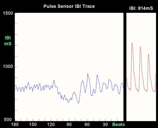
The blue line graphed above in the large data window is a running history of IBI values, and correspond to the scale on the Y axis. The blue line graph advances to the left 3 pixels with every heartbeat, and the new IBI value appears on the right where there is a little red dot. The red trace on the right side is the live Pulse Sensor data, so you can see the pulse waveform and debug your Pulse Sensor. The code has some nice keyboard command features built in.
- If you press 'S' or 's', you will save a .jpg image of the program window for posterity in the sketch folder
- If you press 'R' or 'r', you will clear the IBI window (kinda like shaking an etch-a-sketch)
While taking the reading above, I spent a few minutes noodling-around on the Internets, and then began focusing on my breathing, taking slow, deep breaths. You can see the difference in the blue waveform. I started focusing my breath at about the 90 beat mark, and from that point my IBI began to follow more of a regular sinusoidal pattern. It's easy to affect your IBI rhythm by changing the pattern of your breath.
Up next is an examination of HRV by checking out the Frequency Domain.